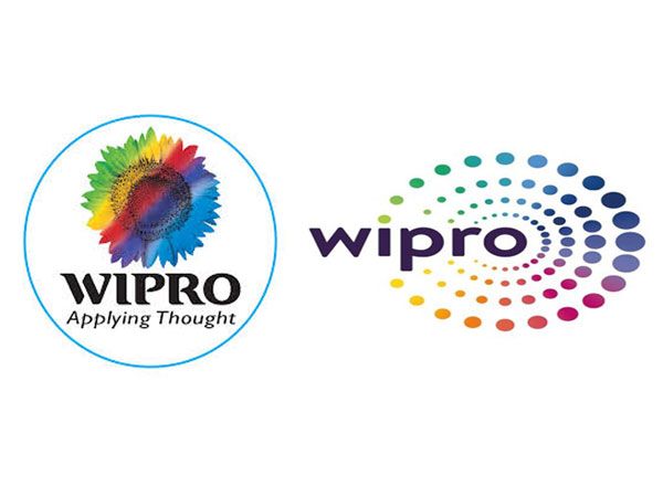
Wipro On an Overhaul Mode: Changes Logo After Two Decades
Wipro changed its logo from a multi-coloured sunflower to a new logo featuring dots.
To affirm its standing as a reliable digital transformation partner, the country's third major IT company, Wipro, overhauled its logo nearly after two decades with a new one featuring dots. The company's earlier logo that was a multi-coTloured sunflower became its identity since the year 1998.

The new logo mark the company's move to acquire new clients and cater to them with increased localized capabilities globally.
Going by the new logo, Wipro remarks that the new identity reflects the way it 'connects the dots' for its customers. On the new logo, Ajim Premji, Chairman of Wipro comments "Our brand identity is a visual expression of what we do and mean, for our clients... Our re-articulated values connect and resonate deeply with the new, vibrant, brand identity". On the company's twitter account, Wipro CEO, Abidali was quoted remarking "Our brand refresh signals an even closer engagement with clients, greater innovation & deeper impact on their business"
Wipro started its operations way back in the year 1945 as Western India Vegetable Products Limited in Maharashtra. Later the company ventured into the IT sector in the year 1981 and gained its leadership position in marketing of personal computerst in 1985. Know more about Wipro's plan to hire US workforce amid stringent US Visa norms.


